 王张开
王张开about
echarts5.3.2
本篇记录一下使用echarts来生成关系图:
基本上就是vue中使用echarts生成关系图。 数据从django后端从neo4j中获取,然后展示。 这里单独做个demo记录一下相关参数。
html
<!DOCTYPE html>
<html lang="en">
<head>
<meta charset="UTF-8">
<title>Title</title>
<style>
#main {
width: 1200px;
height: 1200px;
}
</style>
</head>
<body>
<div id="main"></div>
</body>
<!-- echarts5.3.2 -->
<script src="./echarts.min.js"></script>
<script>
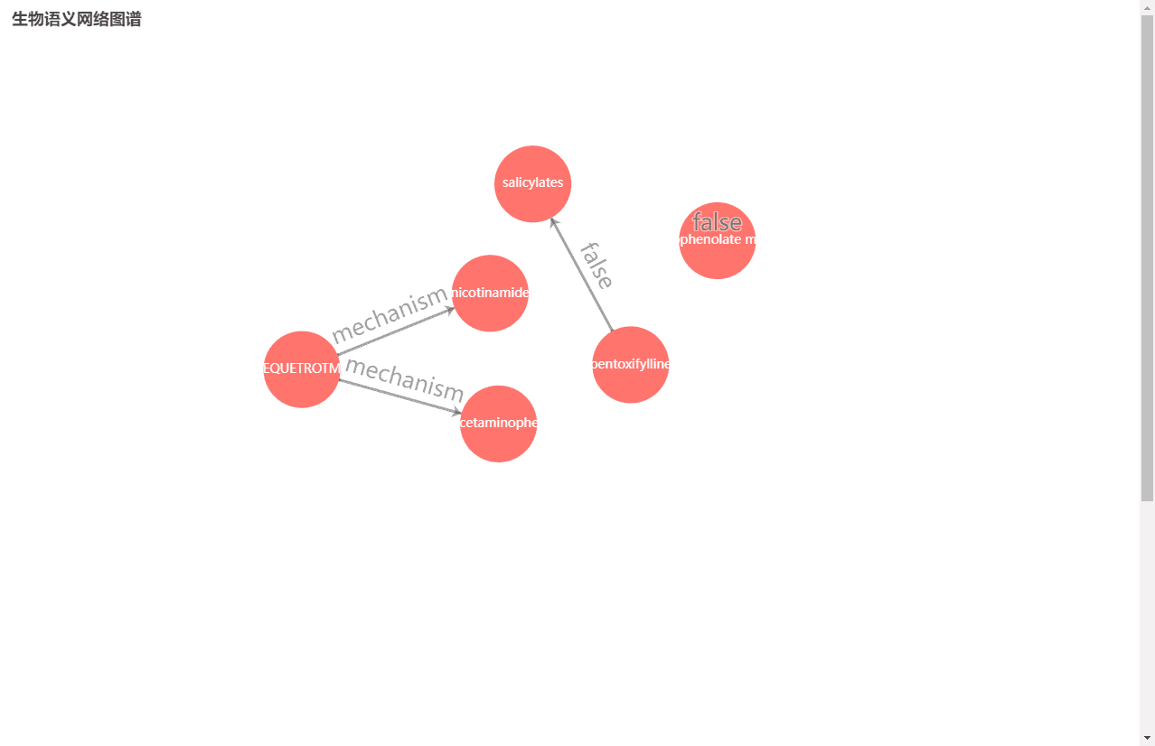
// 从后端neo4j数据库获取的数据,我找了三组代表性的数据
let data = {
"data": [
{"name": "pentoxifylline", "color": "#ff756e"},
{"name": "salicylates", "color": "#ff756e"},
{"name": "mycophenolate mofetil", "color": "#ff756e"},
{"name": "EQUETROTM", "color": "#ff756e"},
{"name": "nicotinamide", "color": "#ff756e"},
{"name": "Acetaminophen", "color": "#ff756e"}
],
"link": [
{"source": "pentoxifylline", "target": "salicylates", "name": "false"},
{"source": "mycophenolate mofetil", "target": "mycophenolate mofetil", "name": "false"},
{"source": "EQUETROTM", "target": "nicotinamide", "name": "mechanism"},
{"source": "EQUETROTM", "target": "Acetaminophen", "name": "mechanism"}
]
}
let myChart = echarts.init(document.getElementById('main'));
let option = {
title: {
text: "生物语义网络图谱", // 标题
},
tooltip: {
formatter: function (x) {
return x.data.des;
}
},
animationDurationUpdate: 1500,
animationEasingUpdate: "quinticInOut",
series: [
{
type: "graph",
layout: "force",
symbolSize: 90, // 圆圈的大小
zoom: 1,
roam: true,
edgeSymbol: ['circle', 'arrow'], // 连接线的箭头设置
edgeSymbolSize: [4, 10],
// cursor: 'pointer',
edgeLabel: {
// https://echarts.apache.org/zh/option.html#series-graph.edgeLabel
normal: {
textStyle: {
// 节点关系字体大小
fontSize: 25,
// 节点关系字体颜色
// color:'#00ff00',
},
show: true, // 是否显示节点关系值。
formatter: function (x) {
// 节点之间的关系数据,我这边的数据是link中的name字段值
return x.data.name;
}
}
},
force: {
// https://echarts.apache.org/zh/option.html#series-graph.force
// 节点之间的斥力范围,值越大斥力越大,可以是恒定值也可以是数组
// repulsion: 90,
repulsion: [90, 170],
// 节点之间的斥力因子,即连接线的长度
edgeLength: 250,
// 节点受到的向中心的引力因子。该值越大节点越往中心点靠拢。
gravity: 0.02,
},
draggable: true, // 节点是否可拖拽,只在使用力引导布局的时候有用。 https://echarts.apache.org/zh/option.html#series-graph.draggable
label: {
// https://echarts.apache.org/zh/option.html#series-graph.label
show: true, // 是否显示字体
// 节点的字体大小和颜色设置
fontSize: 14,
color: "#fff",
},
itemStyle: {
// https://echarts.apache.org/zh/option.html#series-graph.itemStyle
normal: {
// 节点的边框,即描边,设置描边的颜色、宽度、线形
// borderColor: "#000", // 边框颜色
// borderWidth: 2,
// borderType: 'solid',
// 节点颜色
color: function (params) {
// 圆圈的背景色
return params.data.color // 根据后端数据指定的颜色
// return "#00ff00" //前端写死的颜色
},
}
},
data: data.data,
links: data.link,
lineStyle: {
// https://echarts.apache.org/zh/option.html#series-graph.lineStyle
normal: {
// 连接线的宽度和颜色
width: 3,
color: '#4b565b',
// color: '#00ff00',
// type: 'solid' // 连接线的线形
}
},
},
],
}
myChart.setOption(option);
</script>
</html>